Visualize our passion story: Gump
Role: Product Designer| Deliverables: Landing page
Creative · Passion · Empathy · Pioneer
Introduction
Gump is a visual collaboration platform built around passionate photographers. Our mission is to empower these superheroes who create and capture meaningful memories for this world. From photos upload, selection, comment to approval, we help photographers bring an extraordinary experience to their clients.
In this project, we created a landing to introduce Gump.
My Role
I led the design, user testing, finding solutions, community building of this project from end to end.
Our Users
Before we started designing, we deep dive into the existing behavior of our users to understand them better.
We also conducted a series of users interviews.
We focused on identifying what is the job that our customers hire our product for.
We defined user archetypes and mapped them to their respective jobs-to-be-done.
Problems
Gump does not have an official website
Gump has not set up a corporate page to communicate what our company is about, to our investors and users.
Lack of a platform to redefine a new workflow for photographer
A landing page is the first page to get to know a product and company.
Goals
Let photographers know what Gump is
The main goal is to drive more users to the page and sign up as a user.
Tell our story
To let the people know why we are here and why we have created the products.
Process
We established 4 design principles for the brand and make sure the landing page we design was based on these principles. These principles are centered around our consumers—How consumers portray us as a brand.
Early stage branding
Our goal is to create a distinctive and memorable identity for a product, service, or company that resonates with our personas.
Multiple iterations
Our goal is to re-define the workflow, and it is definitely not easy to communicate something new to our users.
We needed a design that is solid enough to kickstart the user test, so we can learn what people really think about the landing page.
We fail fast in order to learn faster.
Sketches
We started sketching some crazy ideas in our minds. Our focus at this stage is to diverge first, converge later.
Early Stage wireframe
This is how the early wireframes looked like. On the left, we mapped out the purpose of each section, aligning with our design principles. The primary goal is to convince users to signup an account.
Final Designs/ Solutions
Creative · Passion · Empathy · Pioneer
Tell a story
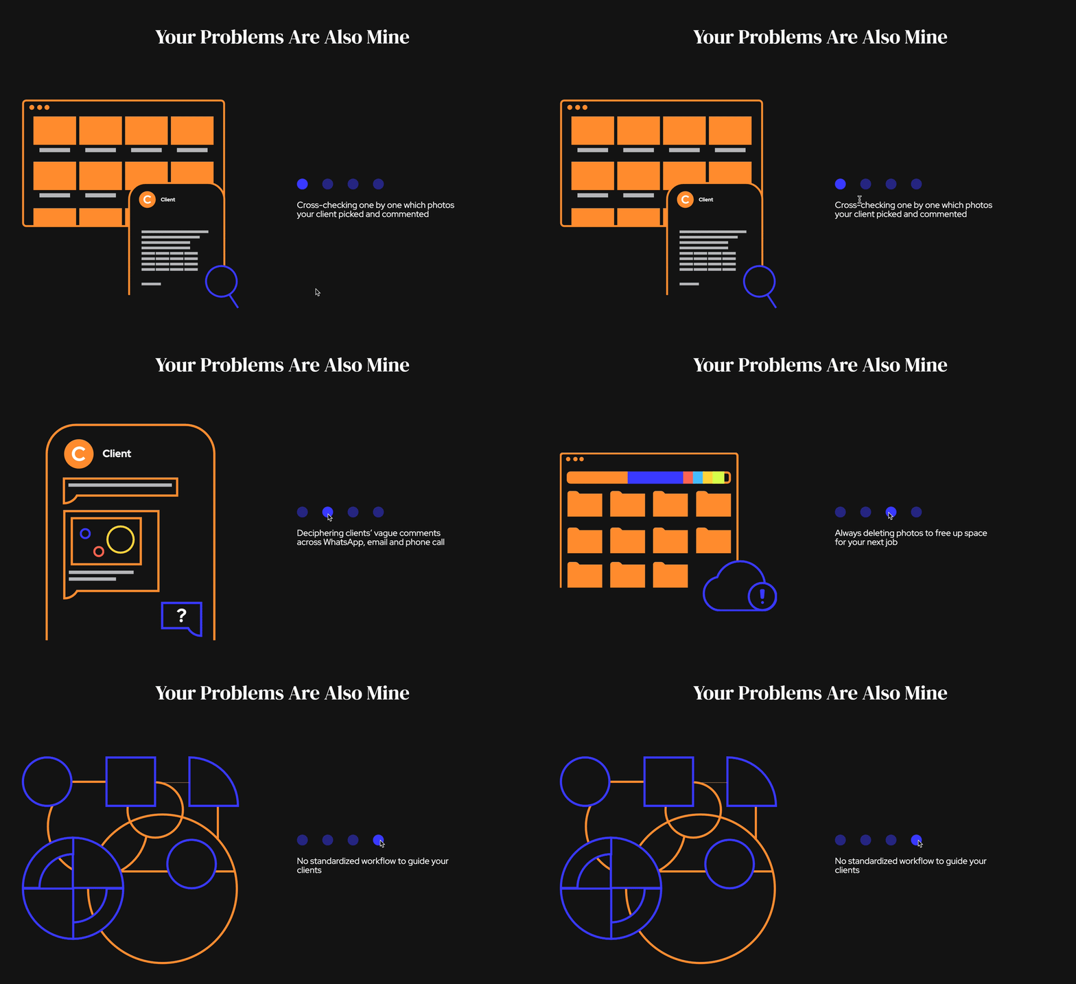
We let them know we understand their problems, and here we are for the solutions.
Relevant headline
We placed different headlines in the mockups so the users can see if they understand what Gump is for.
Sympathy is the key
In order to let people know we understand, we tell them we think the same as them.
Clear value proposition
We centered our messaging around our target audience and let them know what they can get (what our solutions are)
Friendly, relevant copy
Though the experience is digital, we want our visitors to feel like we are engaging in a human conversation.
The copy is designed to be friendly and positive.
“People will forget what you said, but people will never forget how you made them feel.”
Impact
As this is a huge project, we released the products in phases. As we all know, we can always make it better.
What we learned
What the one thing that they want to solve in that step
It’s always important to think and look back to the user journey. That’s why we keep that in mind
what things they are trying to solve in p particular steps throughout the journey.
Always ask more
In order to dive into their behaviors, we always need to ask more.
Also, it is also important to ask more to have different perspectives from users.


