Build from scratch: Moutar
Role: Head of Design| Deliverables: App, Social media, Branding, Brand Activation
Fun · Easy · Green
Introduction
Moutar is a B2C company which is specialized to solve the problems for F&B shops in Indonesia. It helps consumers save and get rewards while empowering small and medium-sized F&B shops to grow in the digital economy. Moutar’s key offering does not only include cashless payments, online/offline deals, planet-friendly products, but also it increases the two ways communications and engagements between consumers and shops.
My Role
I led the design, user testing, finding solutions, community building of this project from end to end.
Problems
Lots of F&B shops (restaurants and cafes) are having a hard time expanding their reach and driving repeat sales.
Limitation from Delivery App
Yes, there is no doubt that the Delivery app drives more sales to the shops in some circumstances. But with the distance restriction, it limits the shops to expand their reach. More importantly, 95% of the customers are not repeating/ community customers. Furthermore, they are lack data to show who their customers actually like.
Traditional / Outdated engagement in store
People often need to wait for a long time to have the order, especially in a coffeeshop, most of them are 1-man-show, which the barista takes and makes the order at the same time.
Lack of relationship with their customers
As they are too busy working on the customers’ orders, owners and staffs don’t have time to get to know their customers’ want.
Our Users
Before we started designing, we deep dive into the existing behavior of our users to understand them better.
We also conducted a series of users interviews.
We focused on identifying what is the job that our customers hire our product for.
We defined 6 user archetypes and mapped them to their respective jobs-to-be-done.
Solutions
We discovered it’s important to keep the circle running. In order to empower shops, we need to put ourselves into their shoes.
What do they care about the most? What problems are they facing?
Understand the behavior of their customers
In order to solve the problems for the shops, we dived into their customers - Gen Z
—————— In our customers facing app ——————
Maximize Gen Z power
Gen Z is the generation that relies on social and technology more than ever.Word of mouth is the key
It could go viral. They highly trust the recommendations from their circle and influencers.Gen Z loves sharing everything
With sharing and gifting culture, one-way communication won’t work. They are also into building their own community.Who does love promo and discounts?
With the app, they can collect points with every payment.
—————— In our shops facing app ——————
No boundaries between offline and online when increasing your loyal customers
With zero-hassle in a planet-friendly style powered by custom QR-codes for restaurants
and coffeeshops striving a top-notch experienceGet more orders
Add a QR code to your take-away packaging to increase orders.
Incentive customers with rewards and convert them into loyal ambassadors.Supercharge engagement. Build customer communities
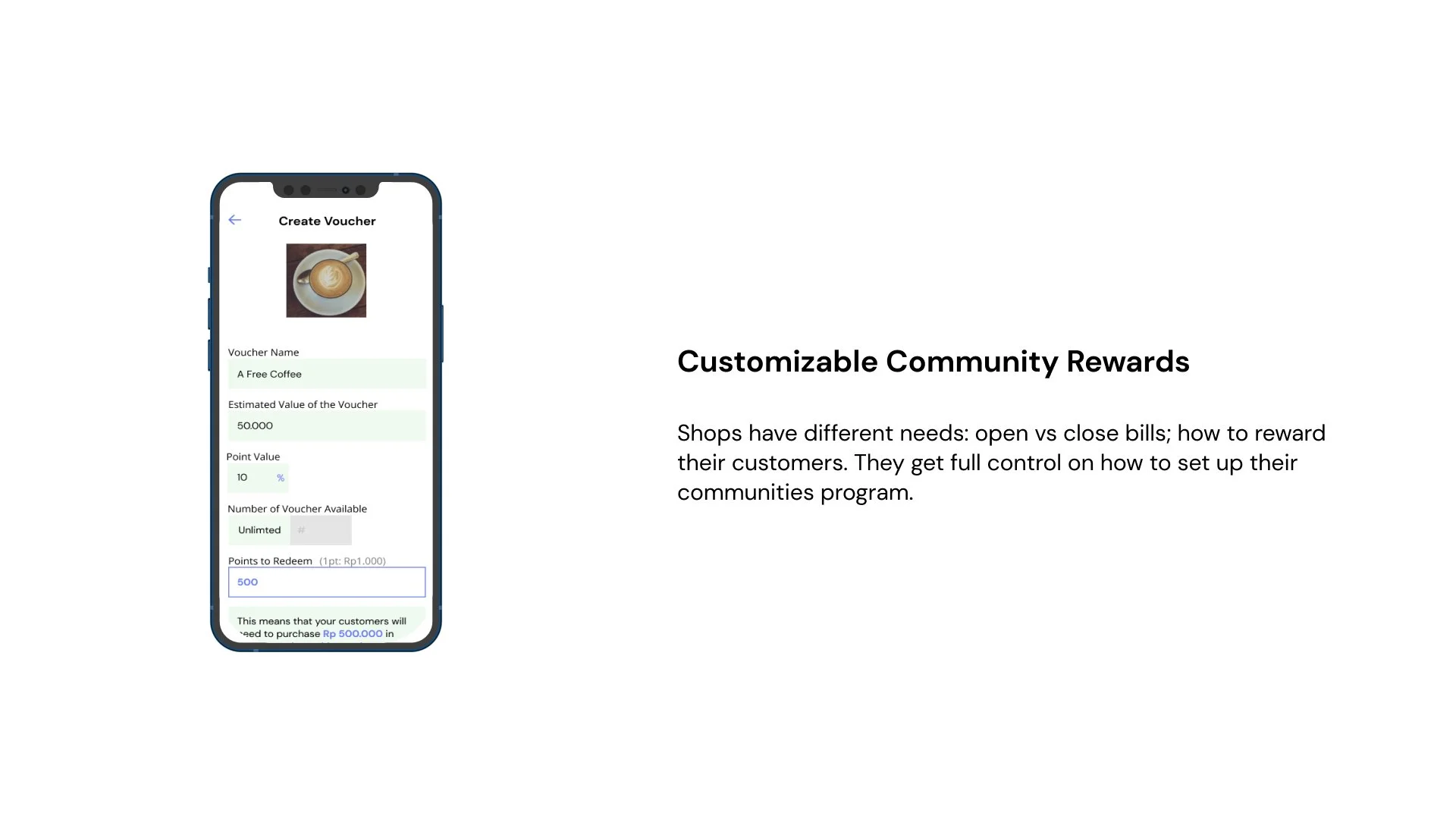
Boost customers with exclusive rewards. They have full control.
Process
Design Sprint
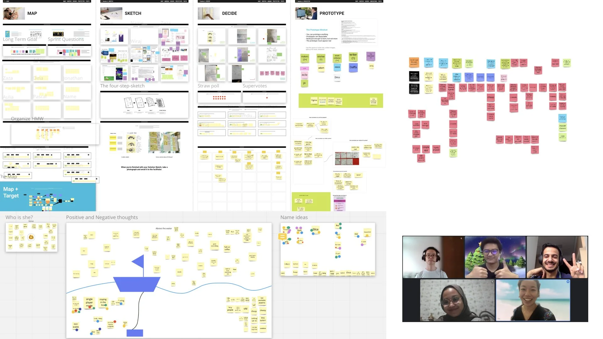
We conducted design sprints to facilitate collaboration between cross-departments. Designer, Strategist, Engineers, and Creatives contributed their fresh ideas in this sprint. The purpose of these sprints is to align everyone on the same goal—To improve our consumer experience by solving our user's problems today.
User flows
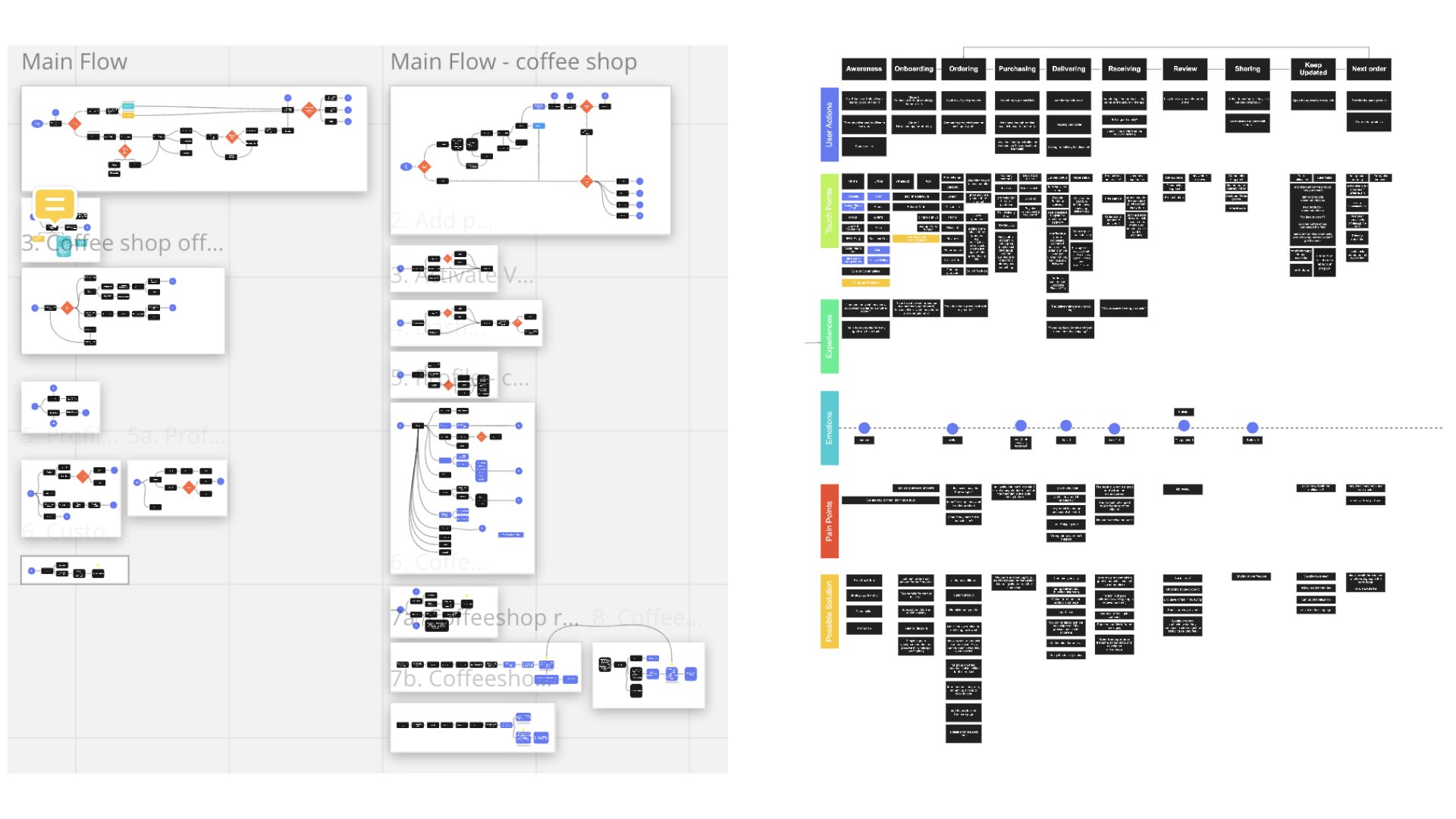
We mapped each archetype to their user journey on the app, with their respective success metrics.
Sketch
I sketched multiple user flows to visualize ideas quickly. My focus at this stage is to diverge first, converge later.
Early Design
Here's a glimpse into the initial wireframes, mid-fidelity designs, and drafts of my project. Each screen has undergone a minimum of 30 iterations, driven by factors such as shifts in business strategy, the impact of a pandemic, adjustments to the product roadmap, or simply a continuous effort to enhance the overall user experience.
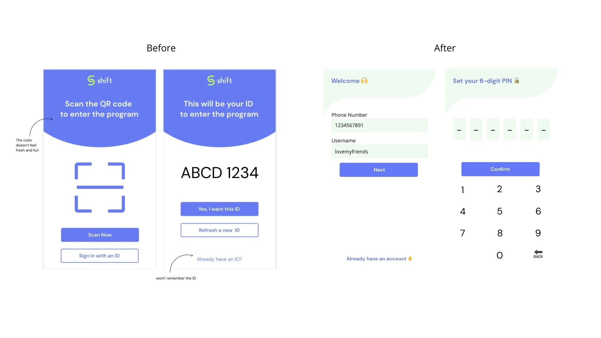
Consumer-facing - Onboarding Flow
We aim to develop a streamlined and effective onboarding process tailored for Gen Z. Despite experimenting with various designs, some did not meet the standards for reasons such as unclear instructions, an excess of onboarding steps, cluttered designs, and a lack of scalability.
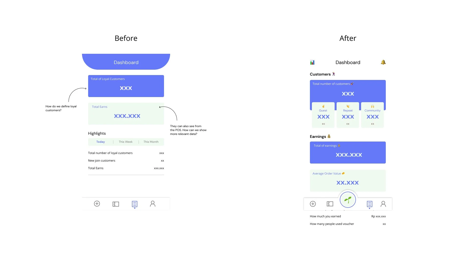
Shop-facing - Dashboard
We're crafting a dedicated dashboard for business owners, offering a comprehensive overview of their loyalty program, statistics, and more. It's not just a functional space but an avenue for continuous exploration, encouraging users to discover new and interesting facets of their business. Departing from the conventional approach of asking users about their preferred Fave product, we're shifting the focus to their initial actions and objectives. Adhering to our design principles, each screen within the dashboard serves a singular purpose. This deliberate approach ensures that we don't inundate users with an excess of content, promoting a more focused and user-friendly experience on the dashboard.
Final Designs/Solutions
—————— In our customers facing app ——————
Fun. Green. Easy
Shift (customer-facing app) has a young, fun look. Here’s to introduce The most fun way to earn and share food.
—————— In our shops facing app ——————
Impact
As we built this from scratch, here’s to present what we have so far.
What we learned
Adapt to the changing consumer behavior
We needed to stay grounded and focused on the goal, but also account for changes to the product needs to match
the changed behavior of customers during the pandemic.
Take it one thing at a time
We learned to break down complicated designs into small, manageable chunks.
This eases development and handles bugs as we go along.


